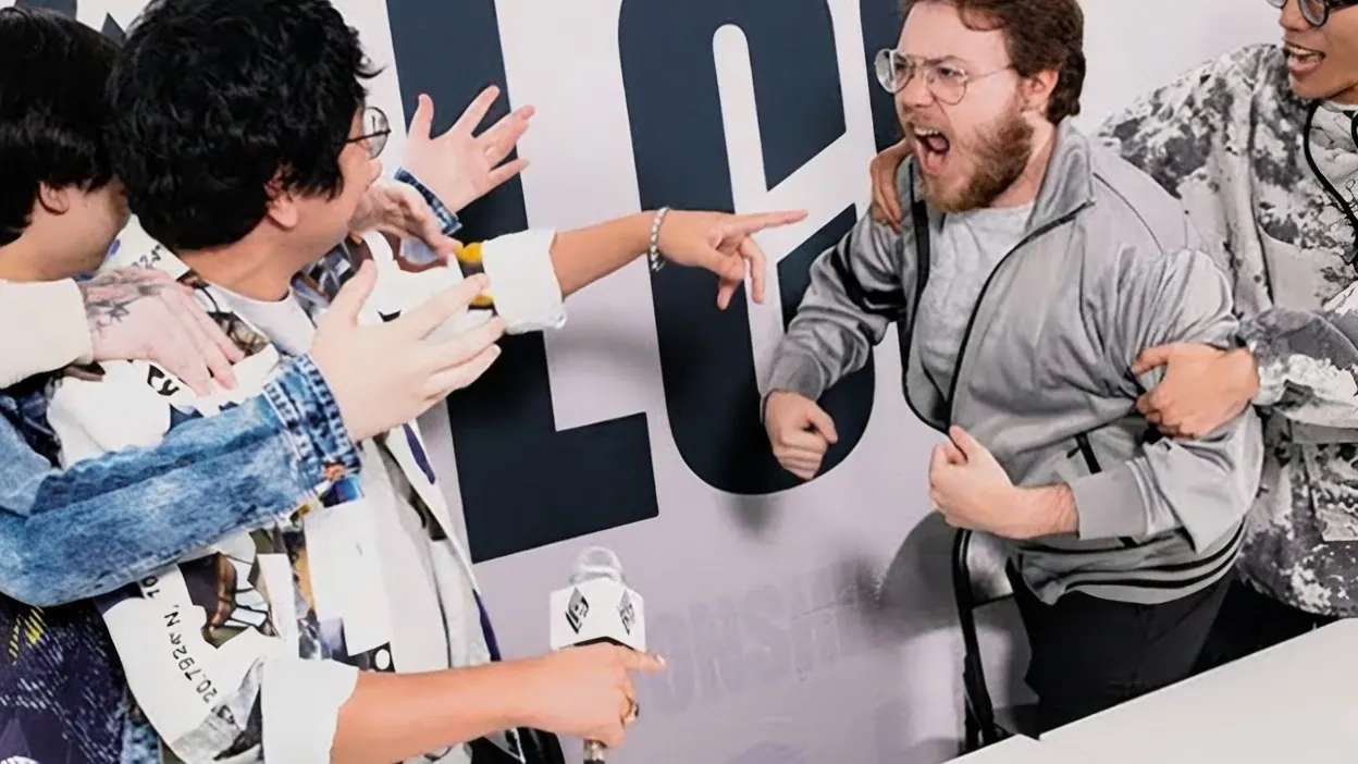
Riot Games came to us with a new brand direction for the LCS, the League of Legends Championship Series, North America's premier competitive league. The 2024 season needed launch videos and hero shots that would carry the new visual identity across the full year: Spring Split, Summer Split, playoffs, and beyond.
We didn't know it would be the final LCS season. Nobody did. But the creative decisions we made, to honor the community's history while pushing the brand forward, ended up being exactly the right ones for a farewell.
The hero shots weren't one-off content pieces. They had to function as a visual system: imagery designed for reuse throughout the season, appearing in league broadcasts, highlight reels, playoff packages, and promotional materials. Everything we created needed to feel fresh the first time and still hold up months later in a completely different competitive context.
The strategic approach was to embed the community's history into the new visual identity so deeply that the fans who'd been paying attention would feel rewarded, and the casual viewers would still see something striking.
We planted easter eggs throughout: a golden spatula hidden in a background, clocks set to times referencing iconic LCS match moments, newspaper props with headlines only long-time fans would catch. None labeled. None explained. In-group signaling, built on the principle that the most powerful brand moments are the ones the audience discovers themselves.
This is the endowment effect applied to creative: when people find hidden meaning, they feel ownership of it. They share it. They tell their community. The discovery becomes content in itself.
The launch videos had to introduce the new LCS branding while keeping faith with what the community already felt about the league. The line to walk: evolve the look without signaling that the league was leaving its fans behind. New visual language, same emotional DNA.
The hero shots were conceived as reusable assets: designed once, deployed throughout the year. We planned the compositions so they'd function in playoff contexts, not just launch week. Every shot had to carry two timeframes: the excitement of the new season starting, and the intensity of the season ending.
Director Bradly Dunn led the production. Editors Jeremie Bouchard and Blake Breton shaped the final pieces. I drove the creative strategy: the concept, the easter egg system, the visual storytelling approach that tied the season's narrative arc into a single, coherent visual identity.
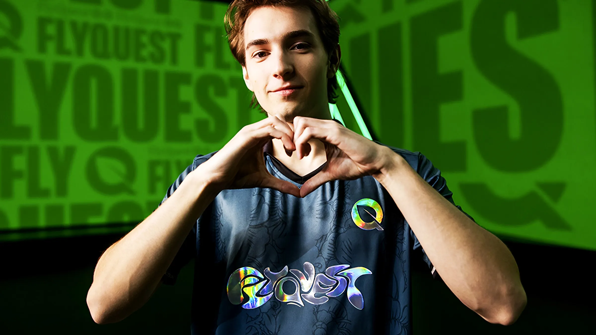
The LCS ended after the 2024 season. The creative work we built, meant to launch a new era, became the visual identity of the league's farewell. The easter eggs we'd planted as love letters to long-time fans became more poignant in retrospect. The golden spatula, the meaningful timestamps, the coded headlines: details designed to reward attention ended up serving as a quiet tribute.
That wasn't strategic foresight. It was a byproduct of building creative from the community's perspective rather than the brand's. When you design for the people who care the most, the work tends to hold meaning regardless of context.
Credits
Director: Bradly Dunn
Editor: Jeremie Bouchard
Editor: Blake Breton
Production: Boombox Group